CHALLENGE
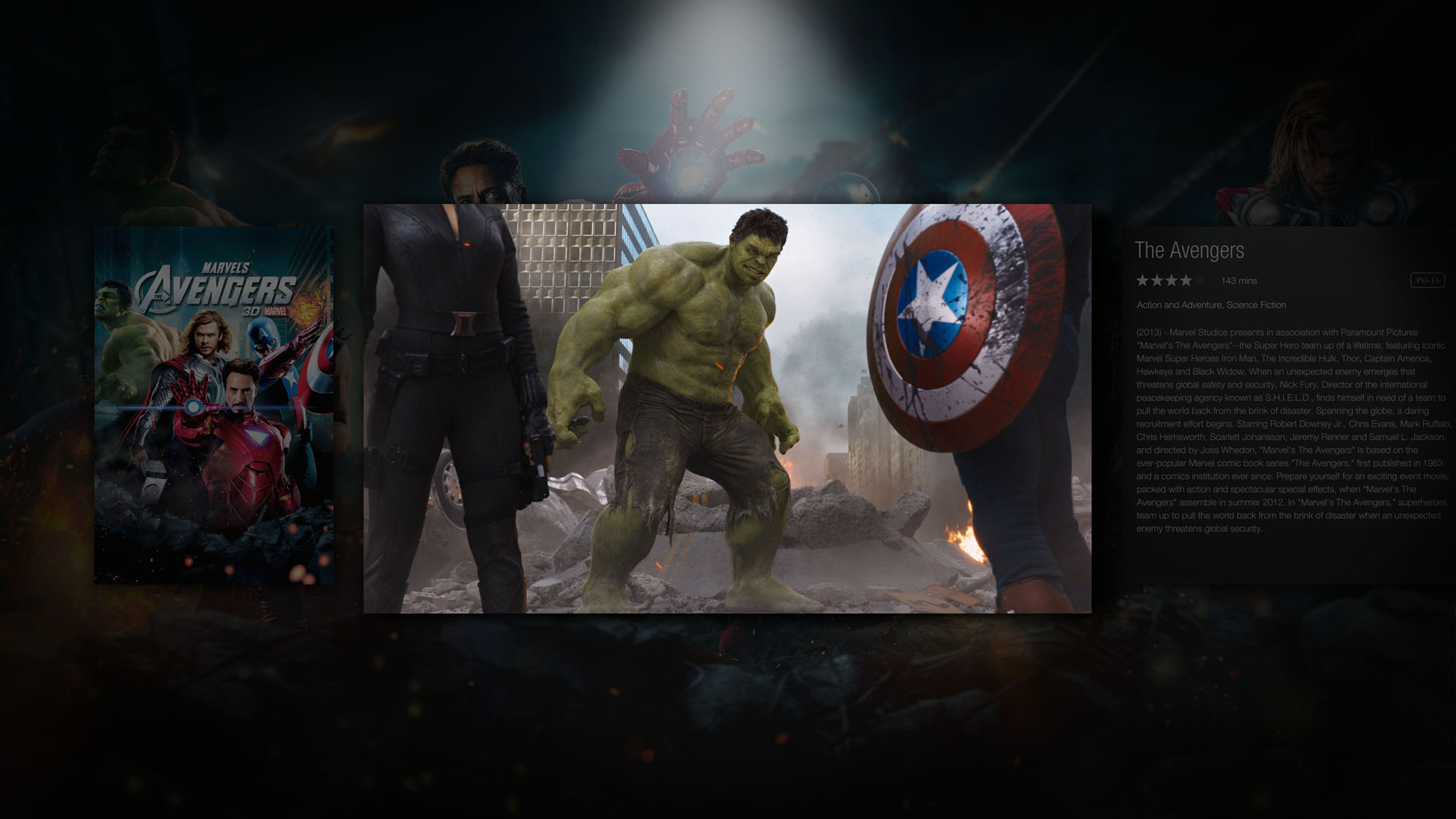
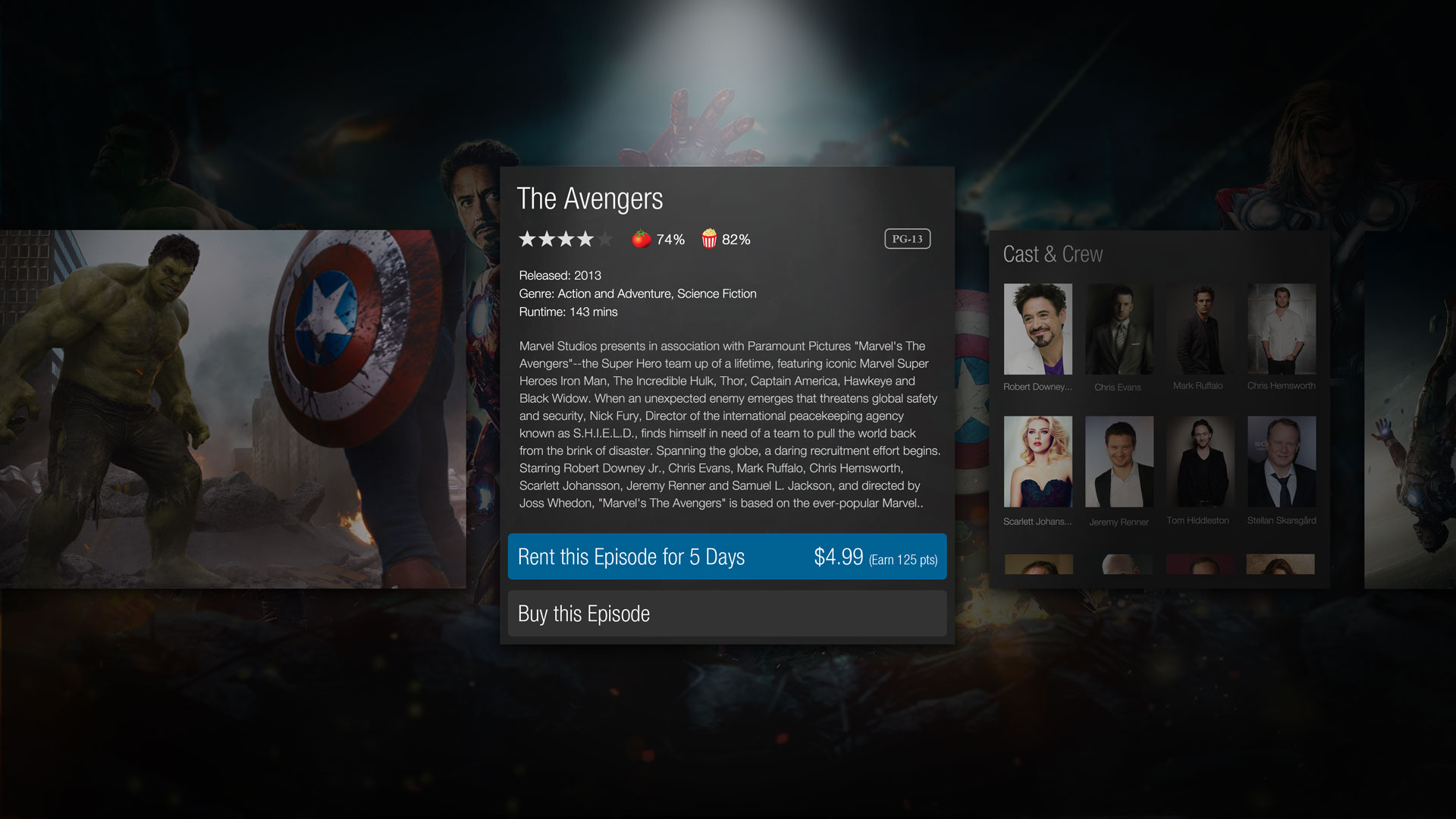
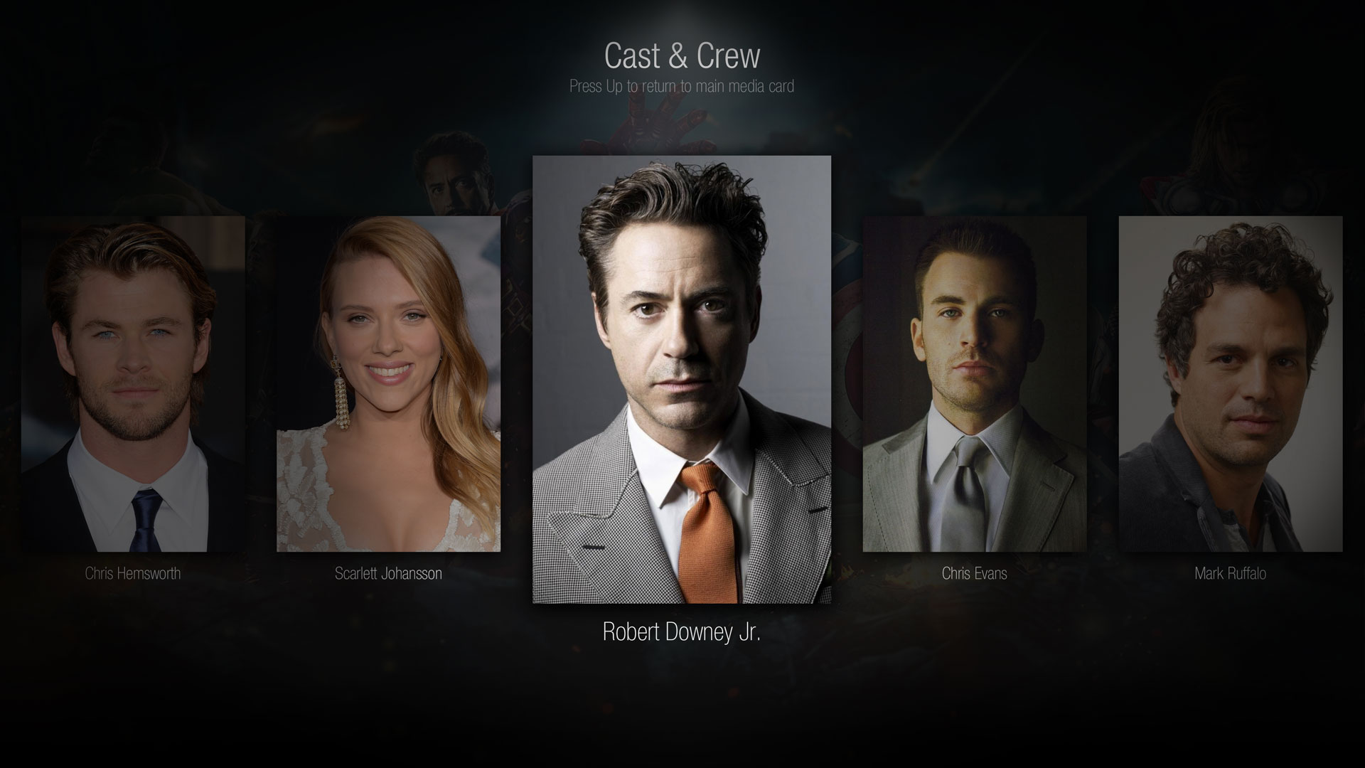
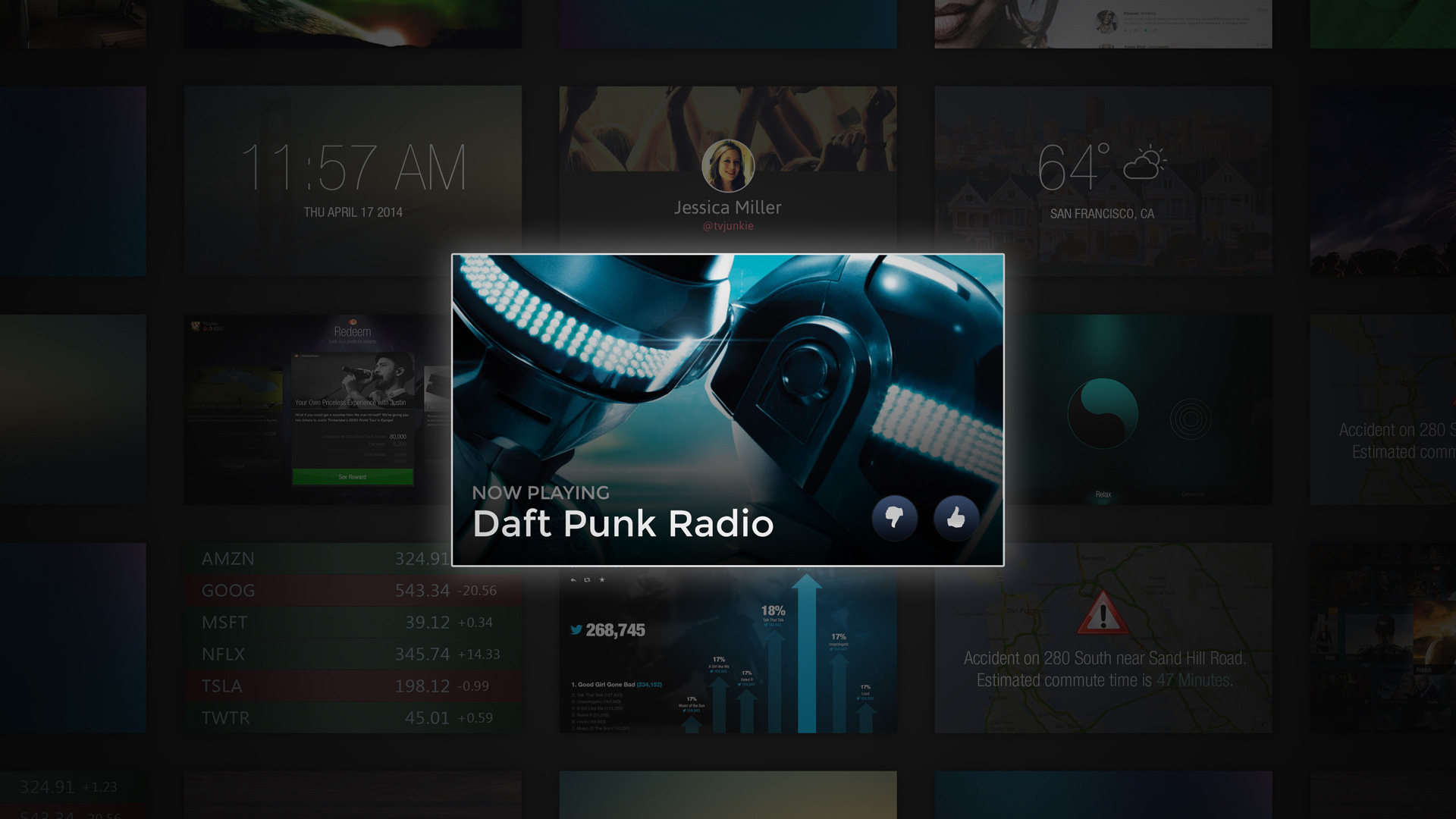
We were asked to create a flagship user experience that leveraged the latest generation video hardware and positioned Nagra as a thought leader in the digital tv space. We wanted to build a practical, deployable solution which clearly demonstrated the advantages of a 4k user experience.
INSIGHT
We began our process by identifying the primary pain points plaguing media browsers of the time. As the sheer number of content choices were becoming available to users, media guides were struggling to adequately organize and display content in meaningful ways.
EXPLORATION
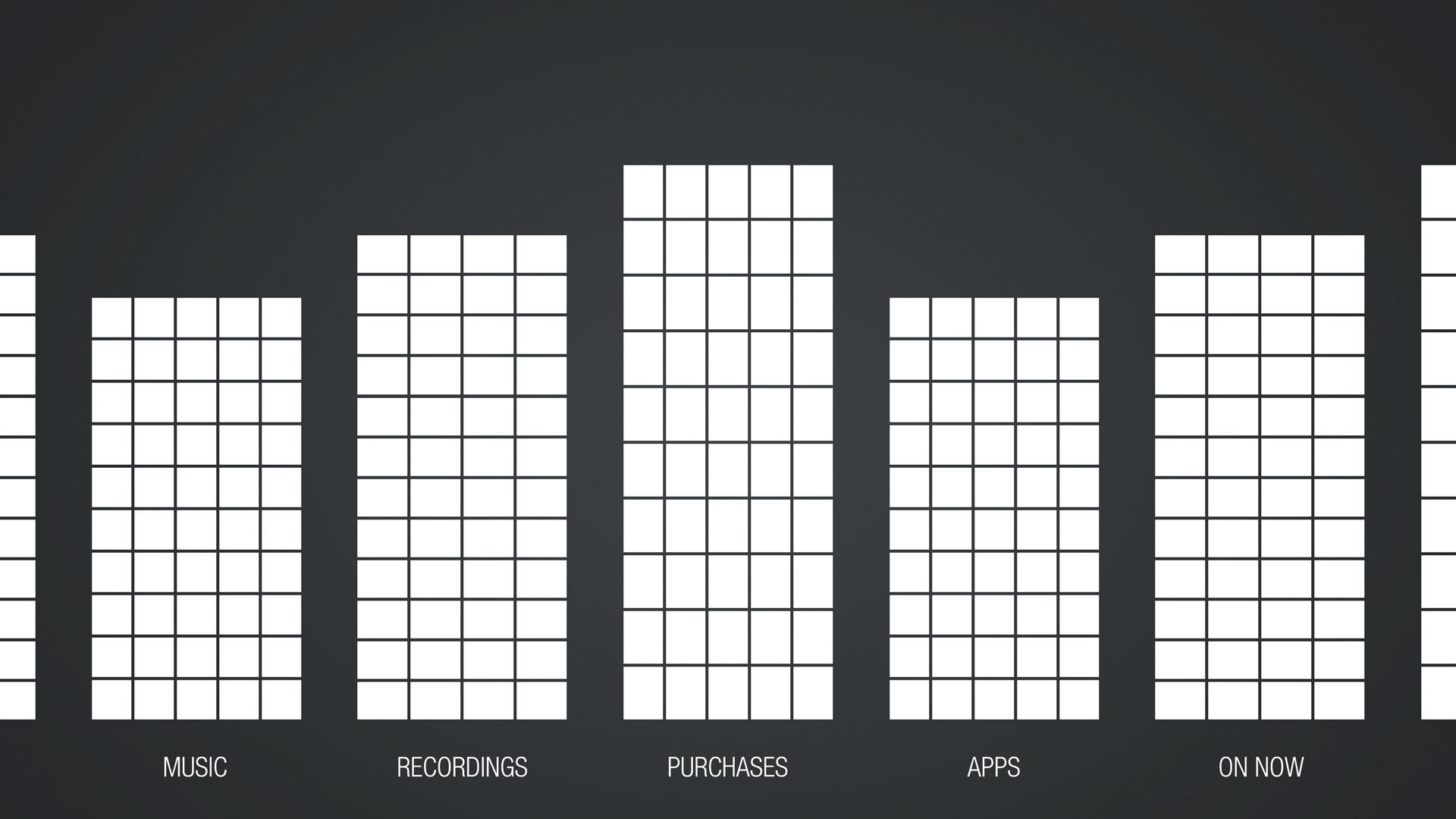
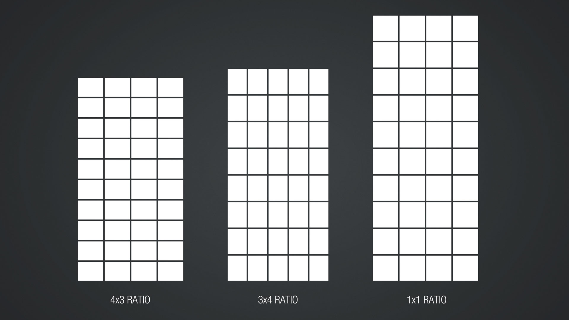
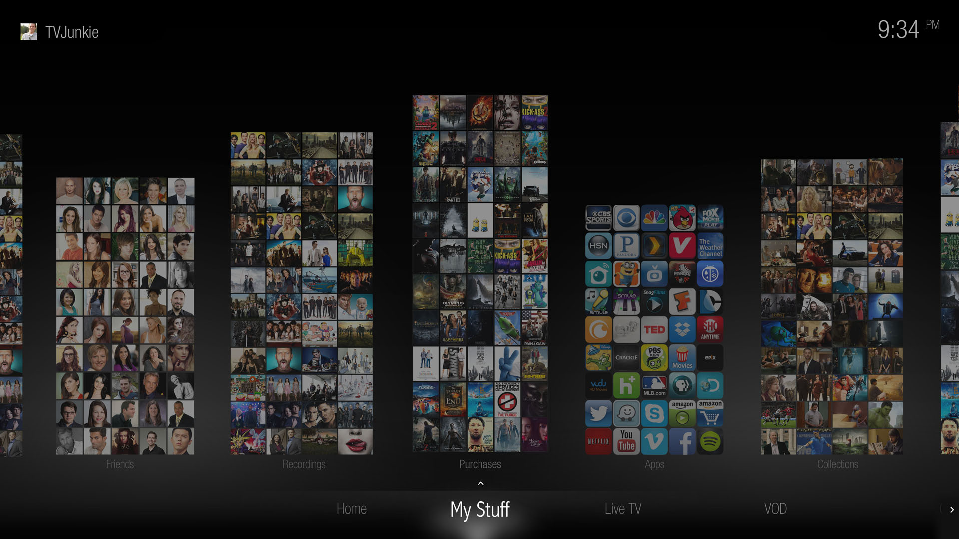
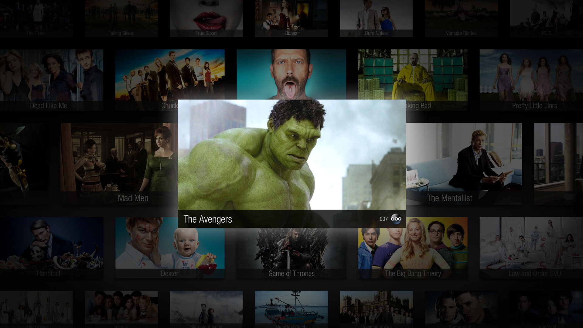
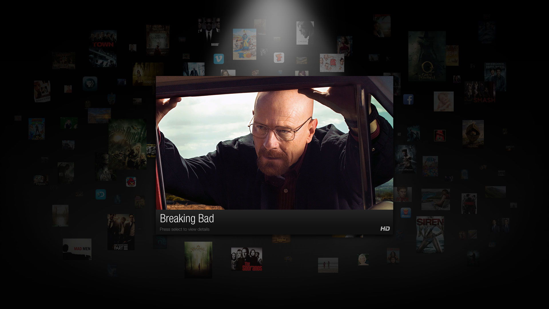
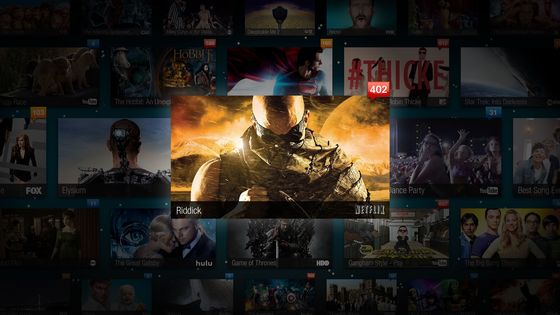
After experimenting with content density and testing our initial designs, we discovered that a major limitation was the design rather than the resolution. Users could easily resolve many times more content items that current designs allowed. Standard single row navigation was the limiting factor.
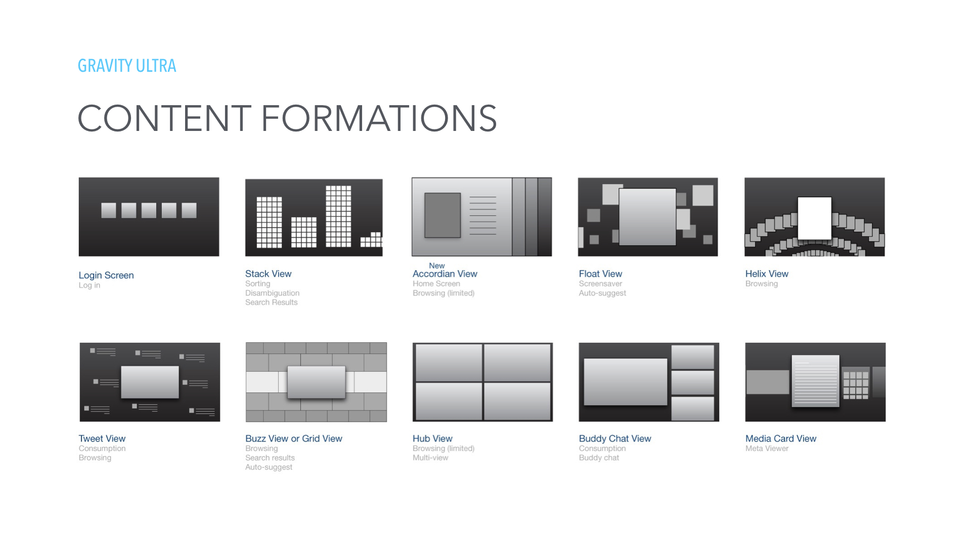
We ideated and focused on designs that removed that need for a flat layout and took inspiration from real world examples of interacting with large amounts of content. We finalized the Ultra view types that maximized vastness of catalog but maintained intuitive navigation.
CONTENT DISCOVERY
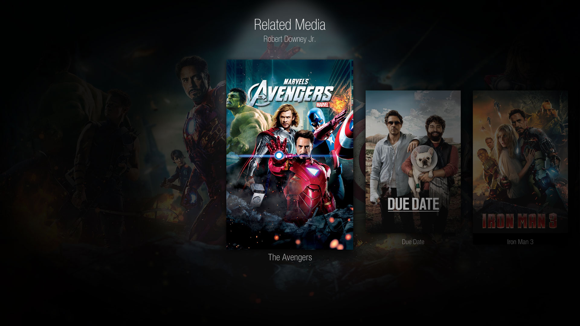
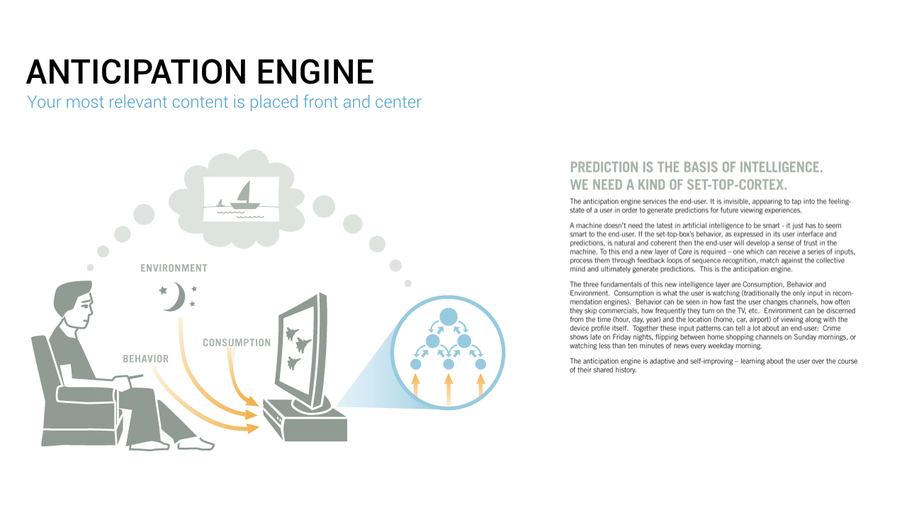
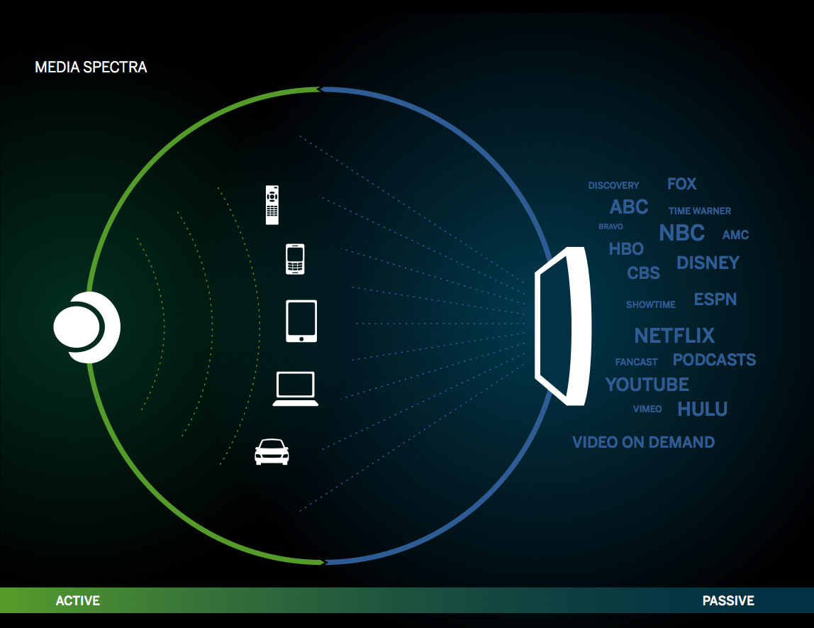
Another project theme was addressing the difficulty for users in cutting through the noise and finding the most relevant content across sources. Traditional usage based recommendation engines were limited and only functioned within silos.
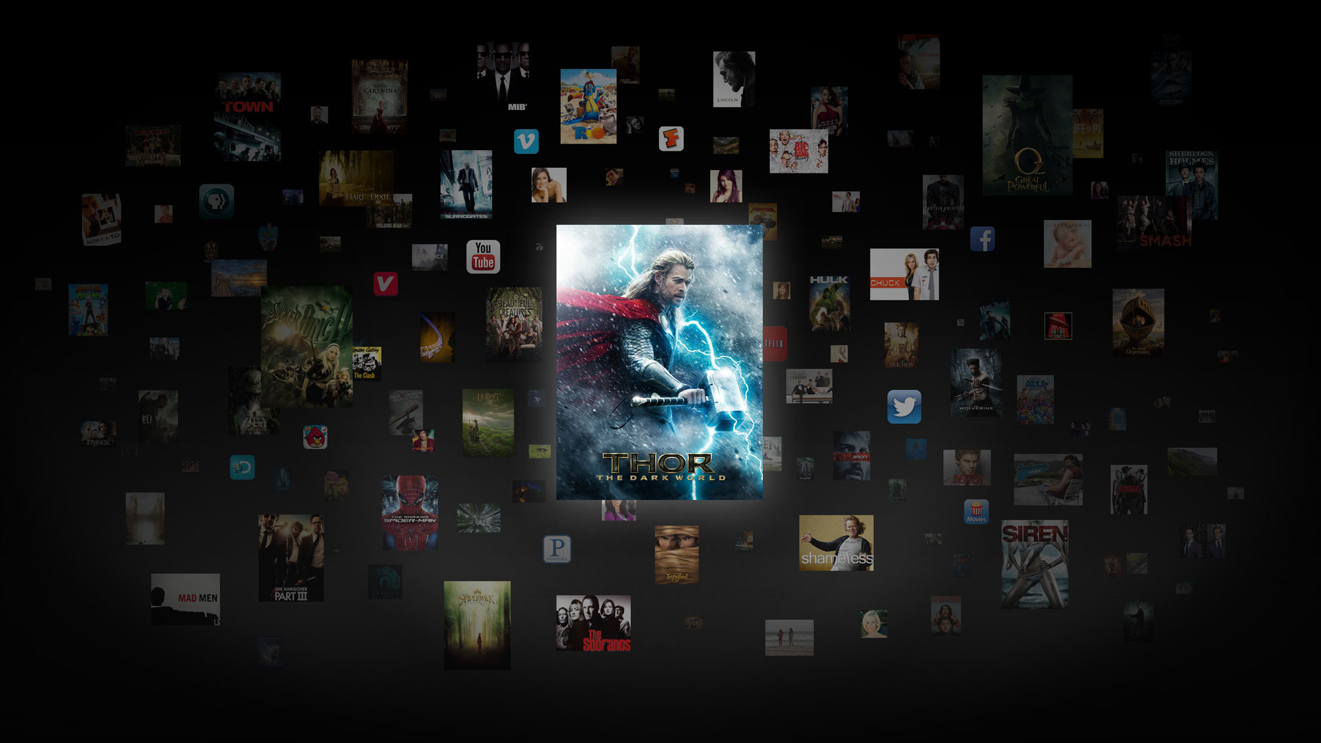
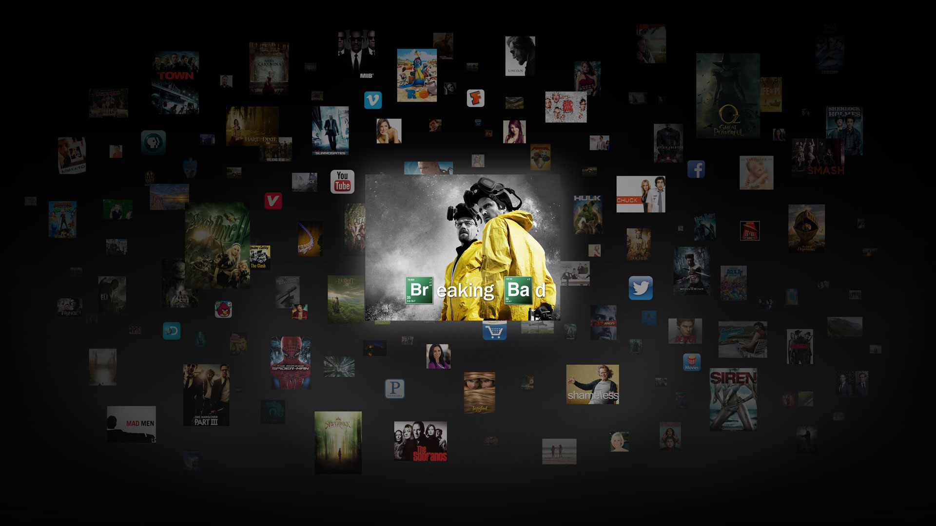
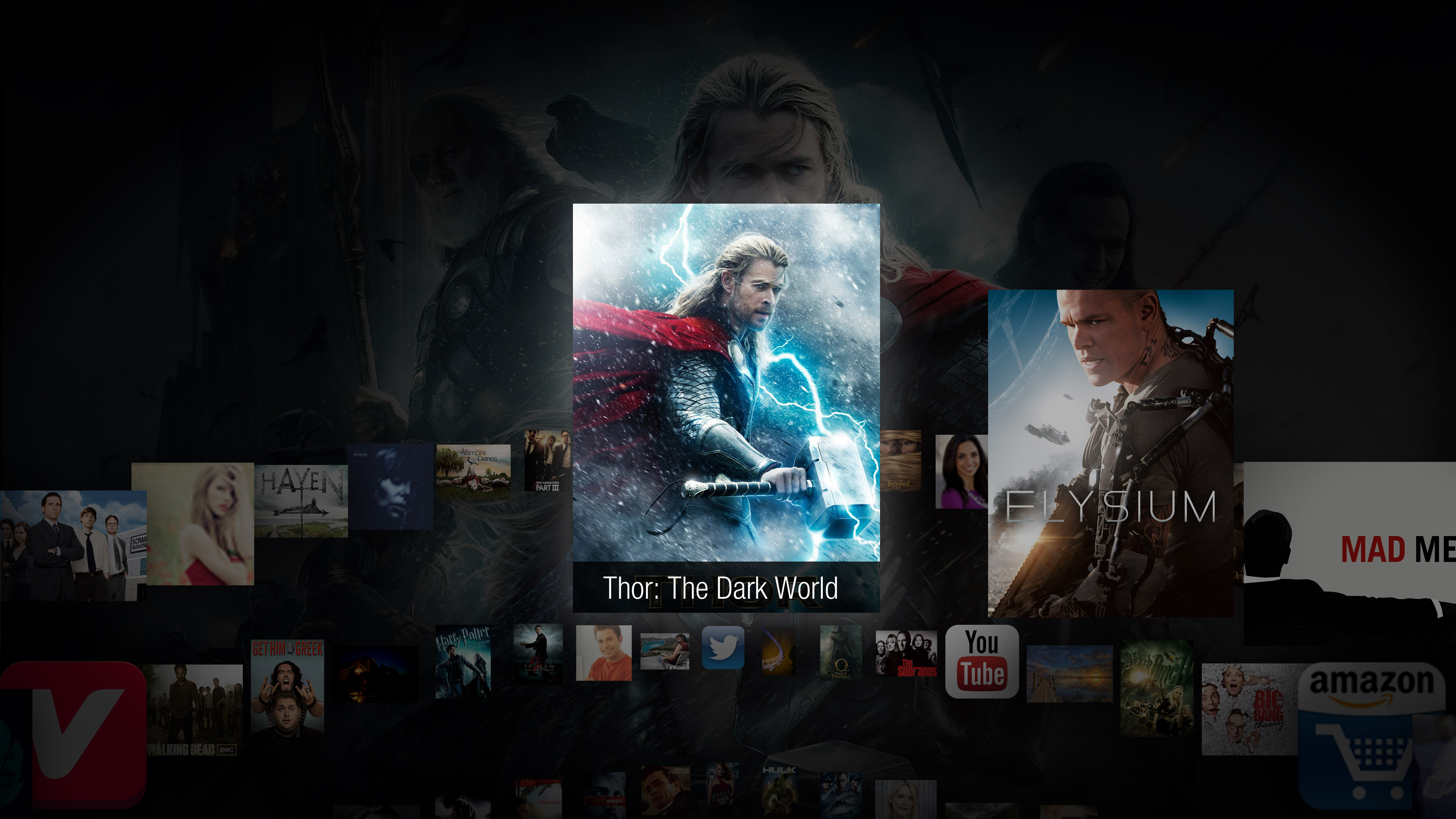
Taking inspiration from the passive TV Guide channels of the past, we created the Smart Playlist feature that maximized content density while maintaining the lean back experience. We used the Z axis as an indicator of interest and put more relevant items closer to you. User could then navigate the Smart Playlist via the Helix View. A 3 dimensional display of all of a users personalized content.
HELIX VIEW
The viewer can take active control of the smart playlist and organize their recommendation cloud into a 3d helix formation easily navigable with a remote control.

