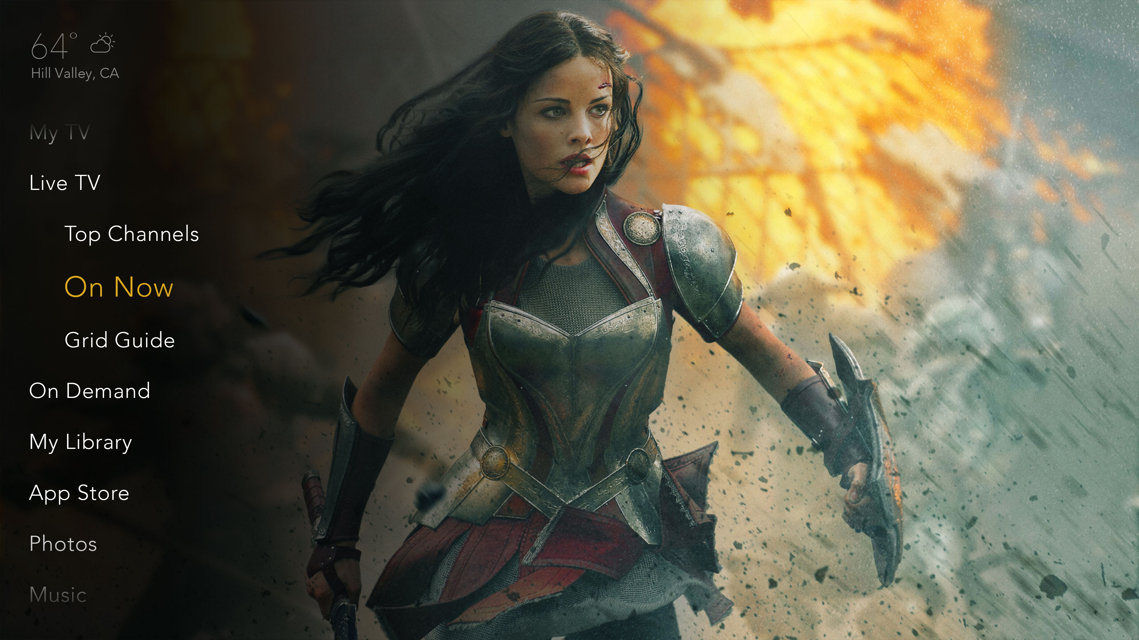
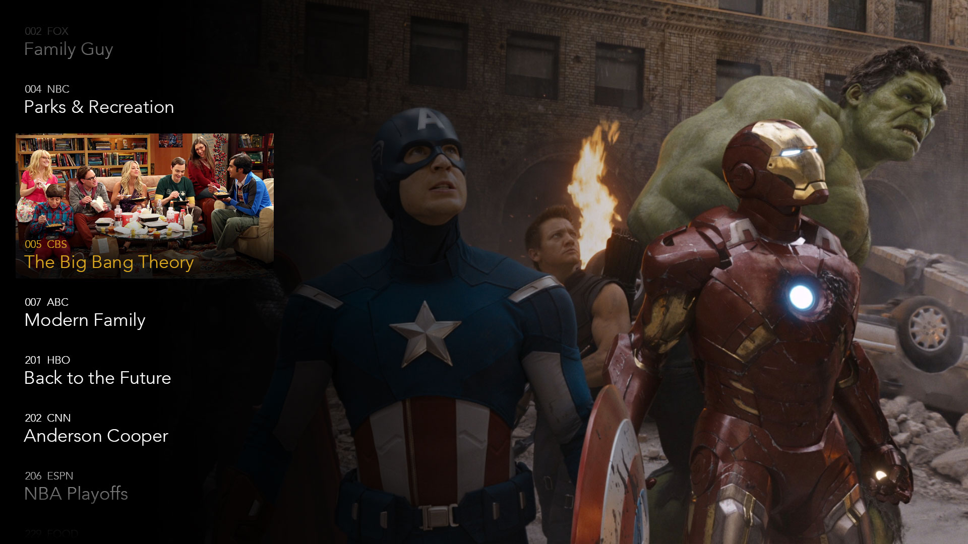
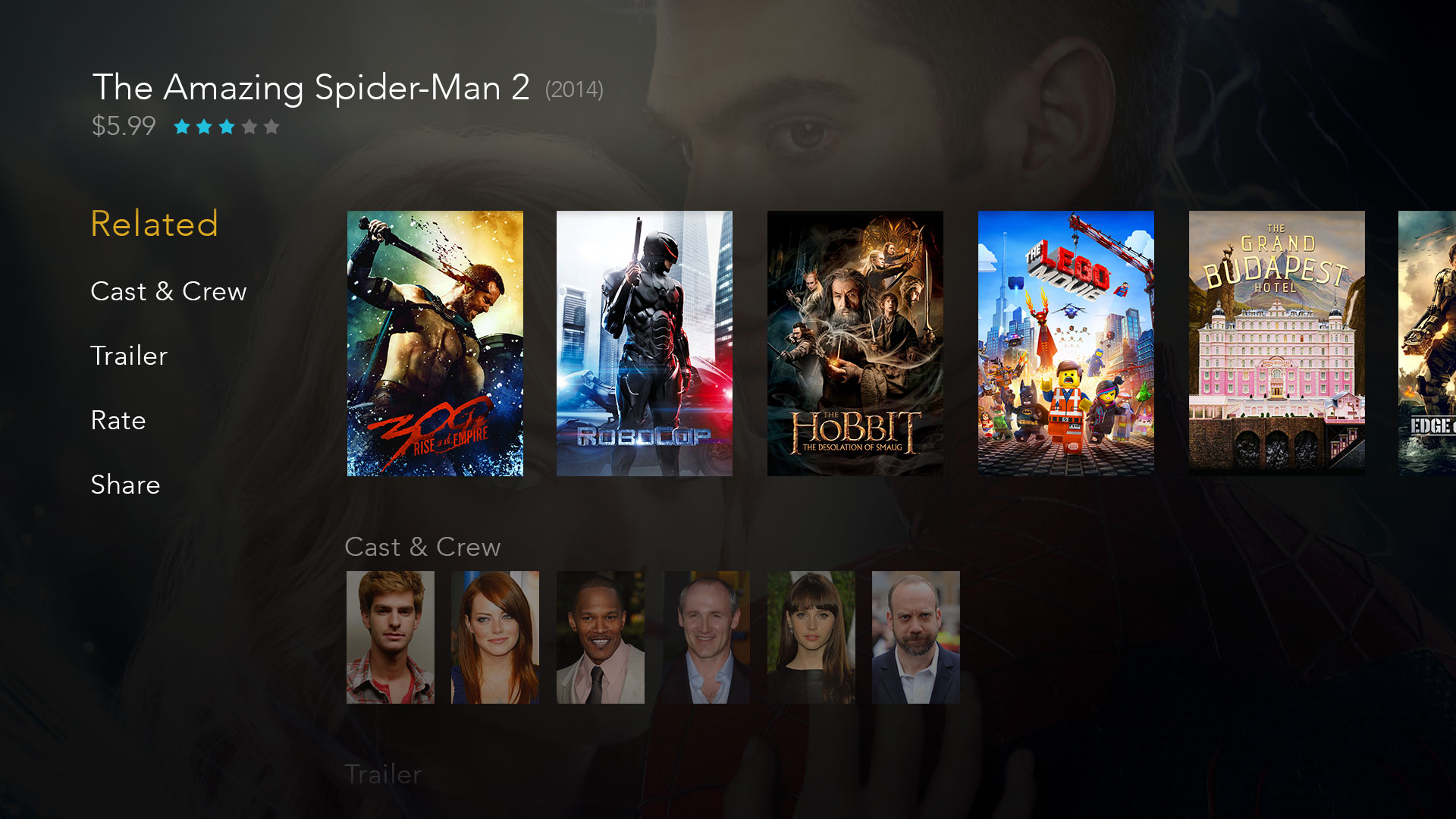
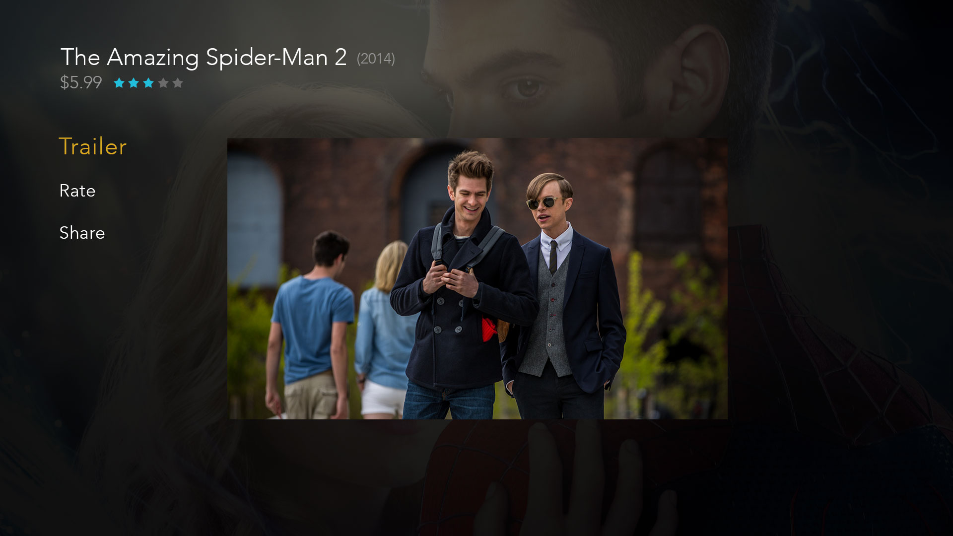
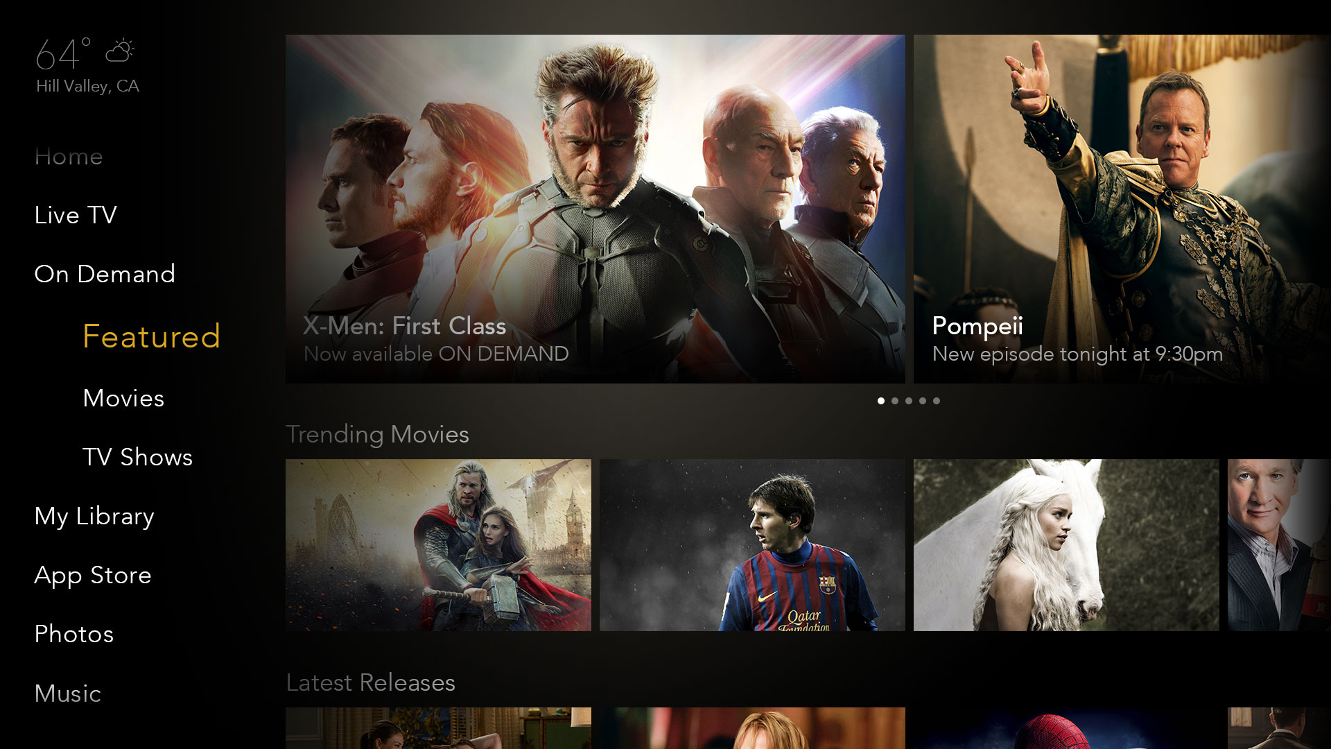
Many modern Television interfaces deliver content choices as a series of strips taking over the screen, causing the average person to spend more time browsing than viewing content. Gravity Edge delivers on it’s primary goal of video first.
The Gravity Edge UI treats video as the centerpiece of a successful user experience. Top level menus are presented to the sides of the video content and employ transparency to overlay the menus unobtrusively over the video plane. The menus progressively expand to take up more of the screen as the user navigates deeper through the UI. This method employs the “Metrics of Commitment” model in which the user’s commitment level to the content determines the amount of screen space the menu occupies. When the user invokes the UI while watching a video their commitment to that piece of content has lessened and therefore we can display the interface in the margins of the screen with minimal distraction.
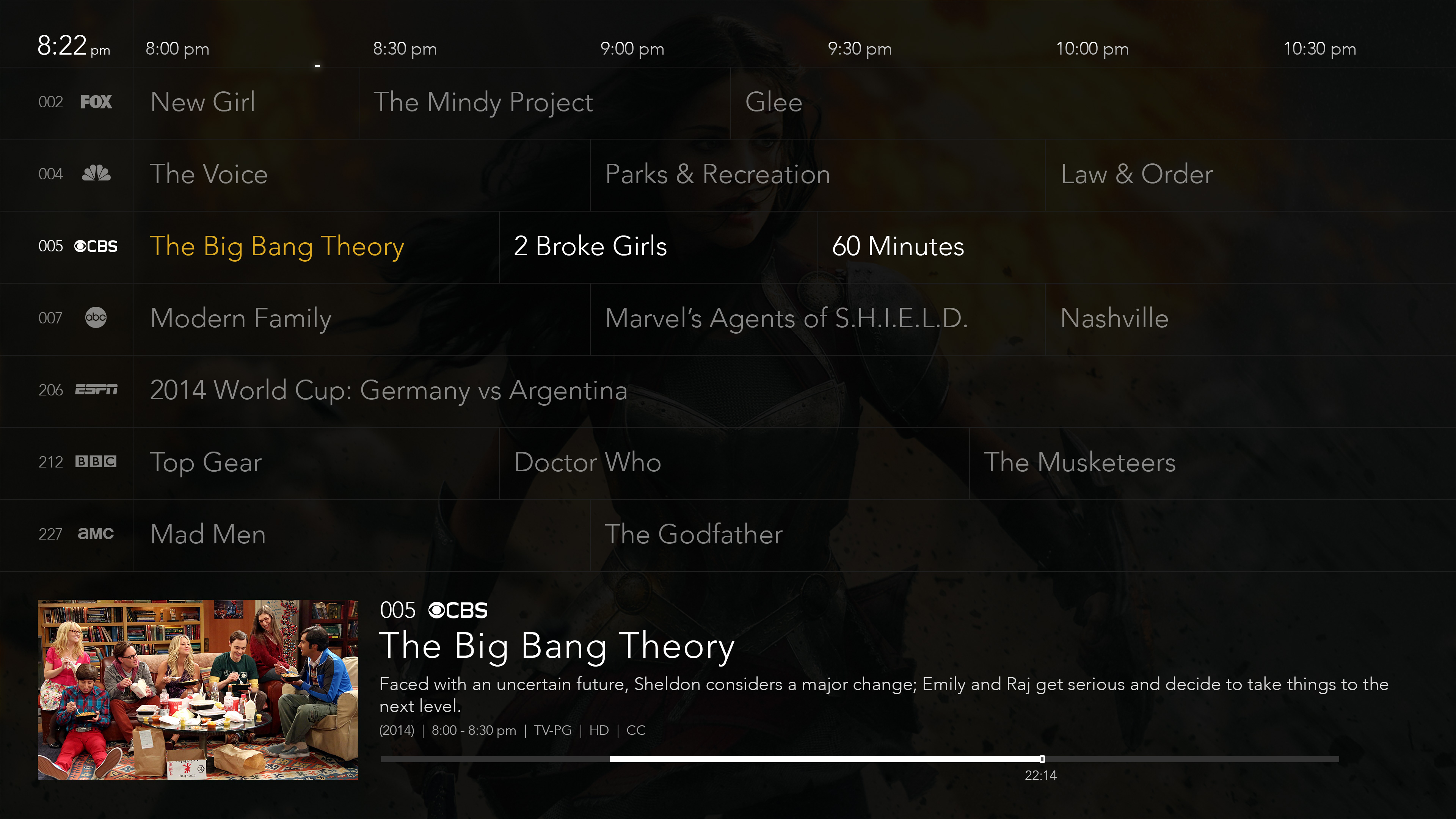
As the user navigates further into the menu structure, their commitment level to the background content is further lessened and therefore we can utilize even more of the screen real estate.
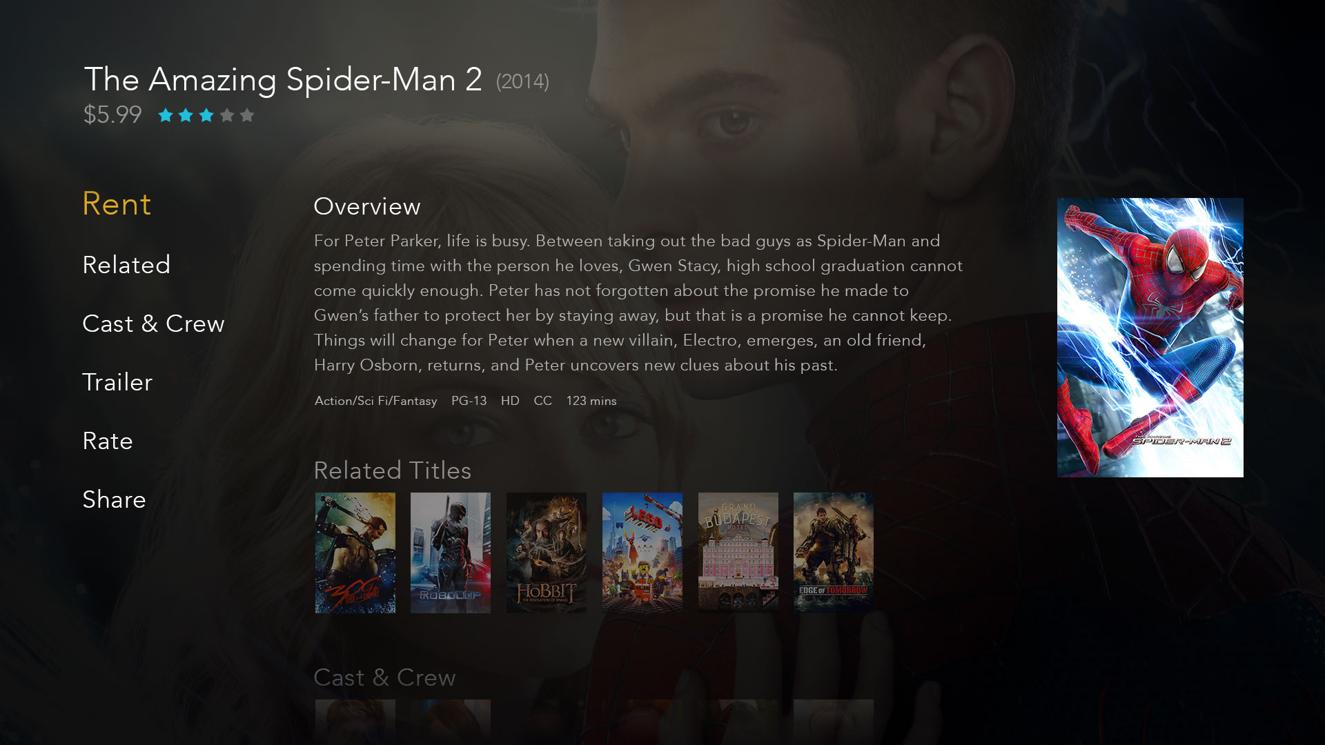
Once the user is actively browsing alternative pieces of content, they are the least committed to the background video and therefore we can utilize the entire screen.

